A Place at the Table is a nonprofit pay-what-you-can cafe located in Raleigh, North Carolina. In its first two years of operation, the restaurant has gained national attention for its innovative business model and has provided over 60,000+ meals to people in need.
APaTT approached me to help them unify and organize their brand assets. They needed a
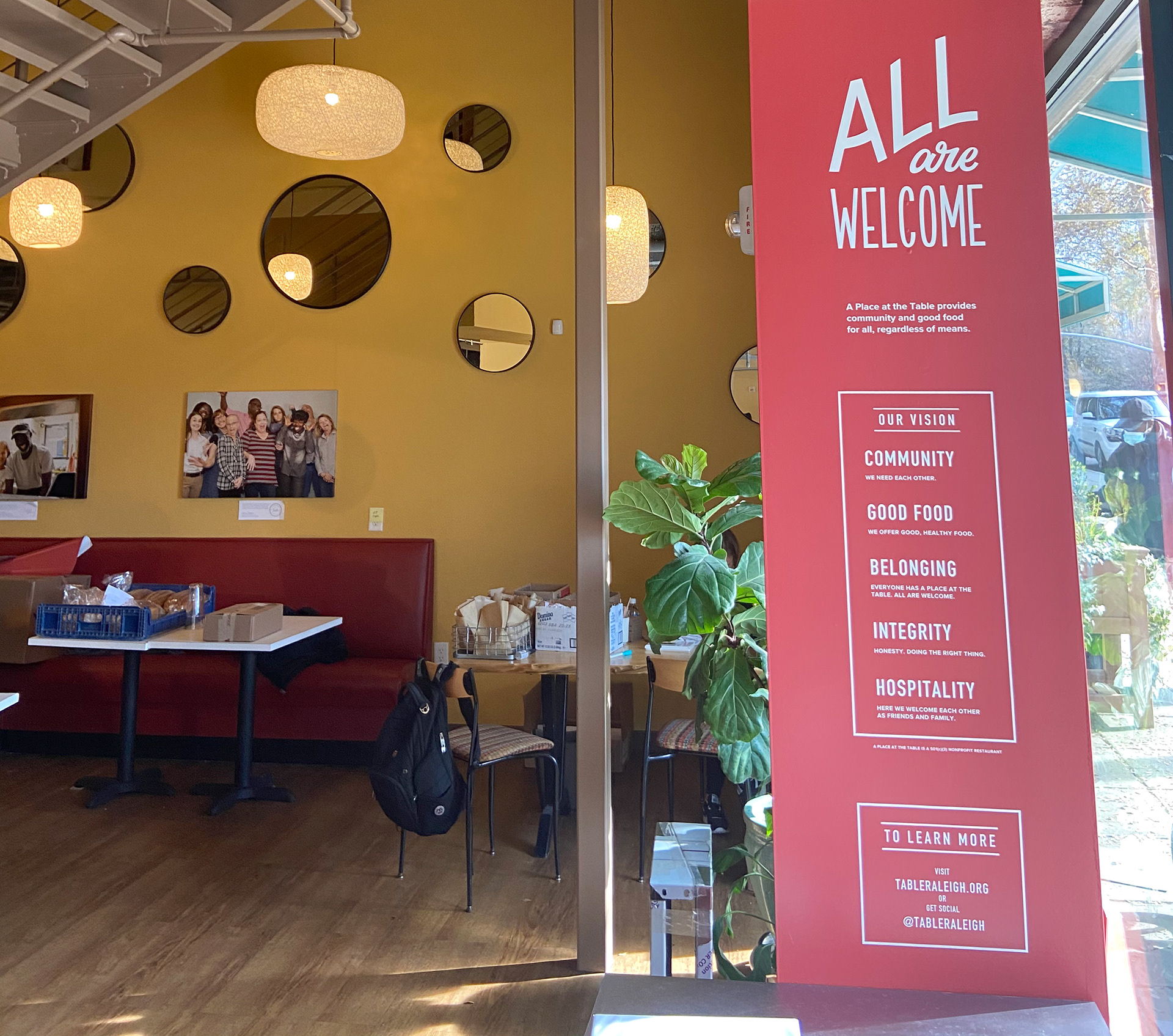
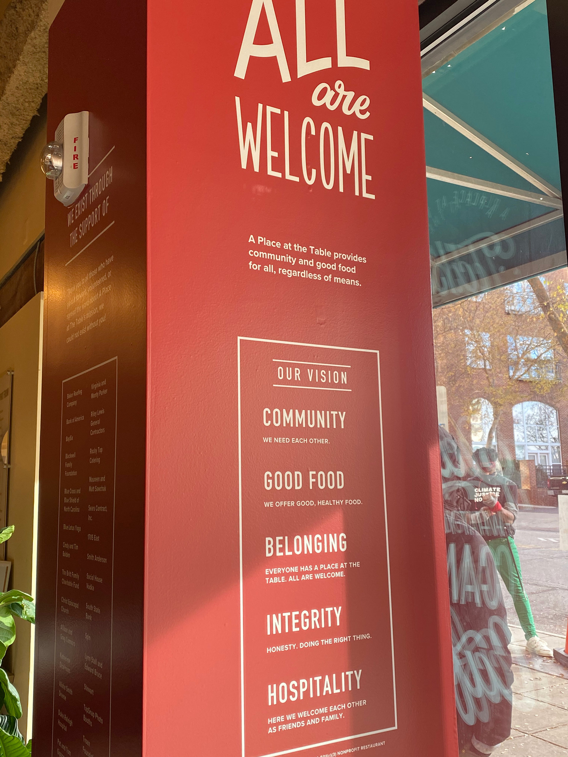
clear way to communicate to stakeholders the nonprofit's mission and values using an understated design language.
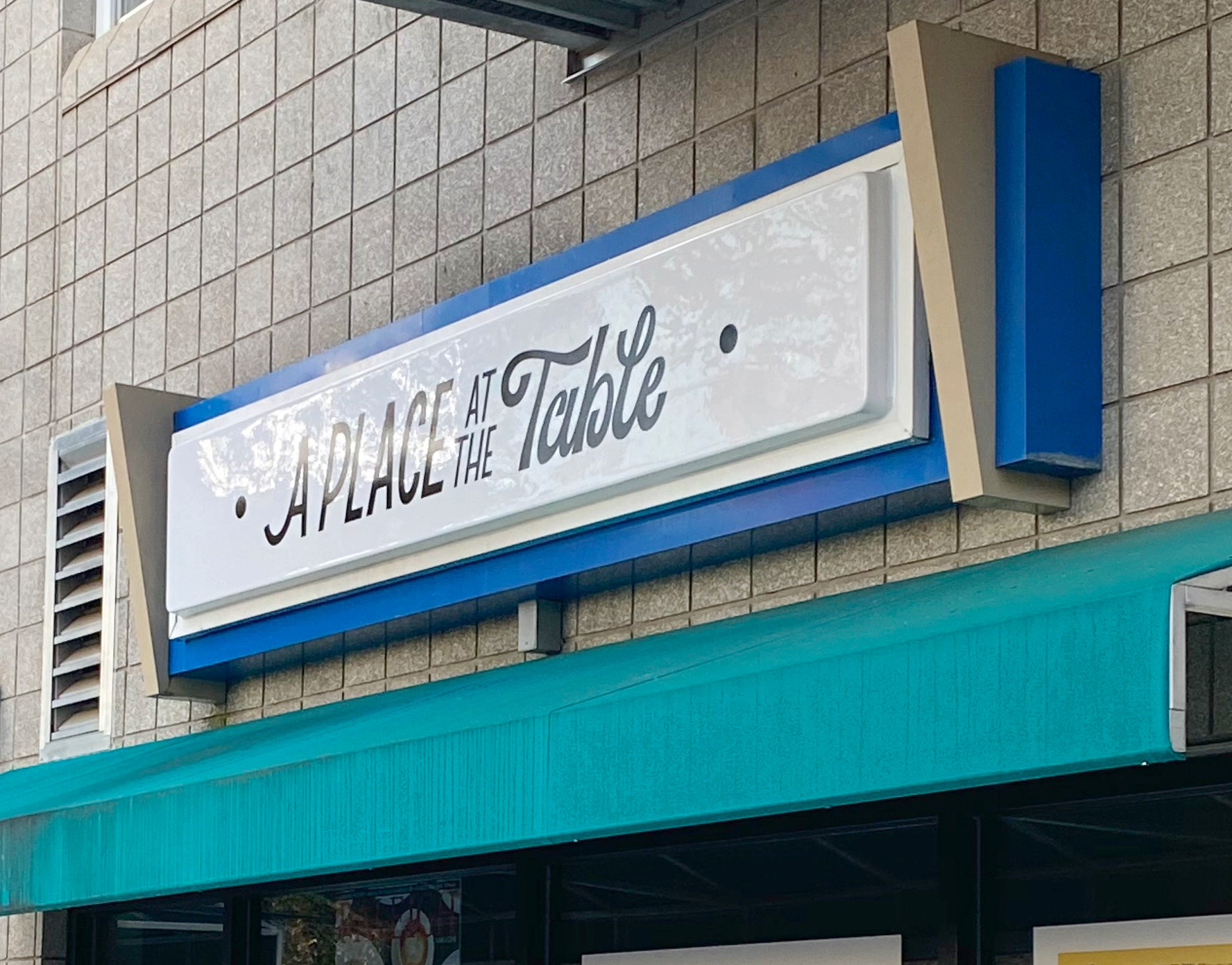
They also needed to distinguish the cafe's storefront from other businesses in the area.
clear way to communicate to stakeholders the nonprofit's mission and values using an understated design language.
They also needed to distinguish the cafe's storefront from other businesses in the area.
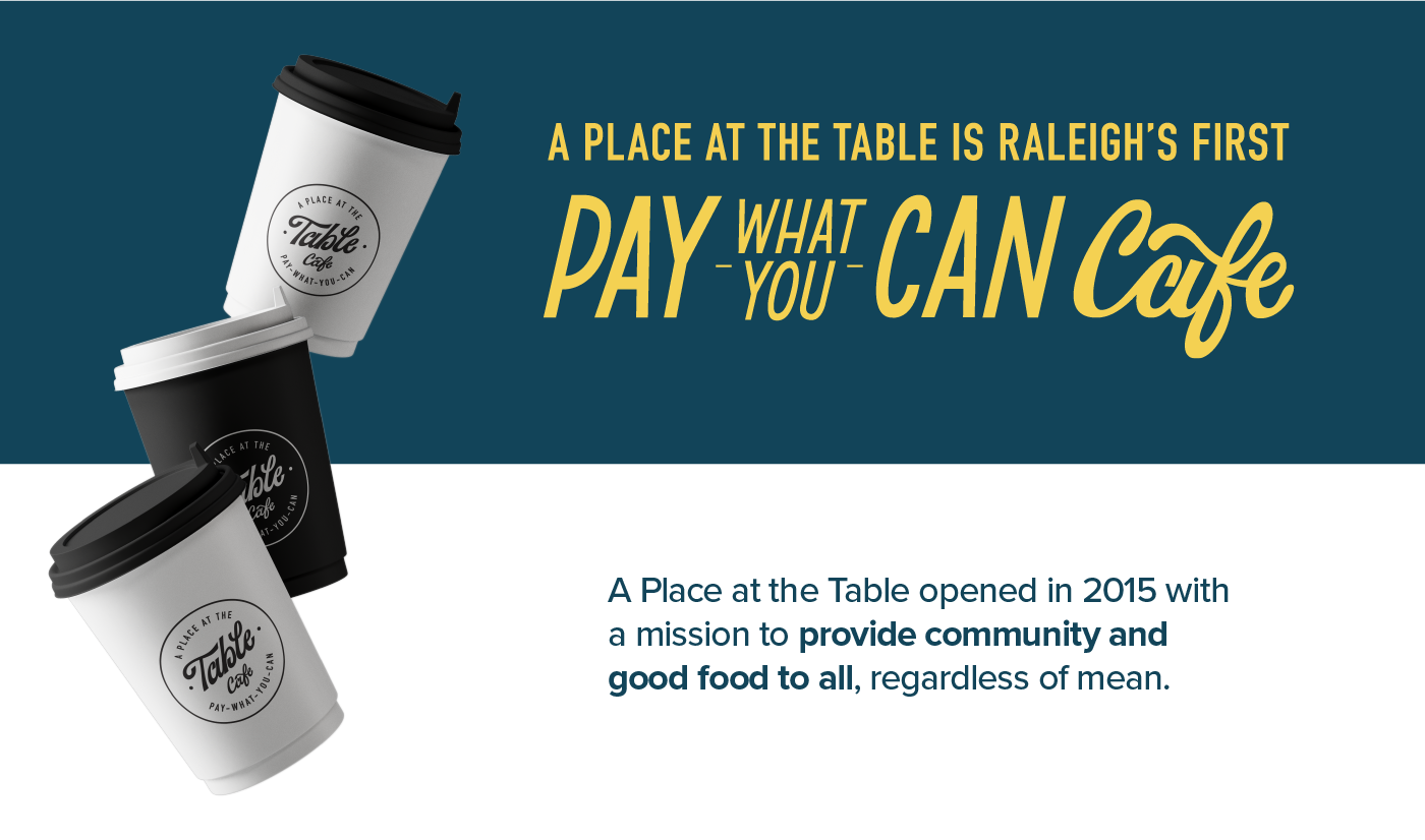
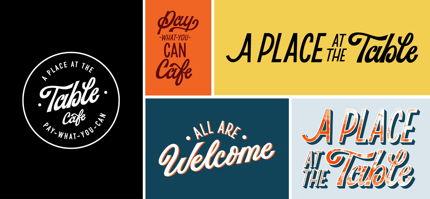
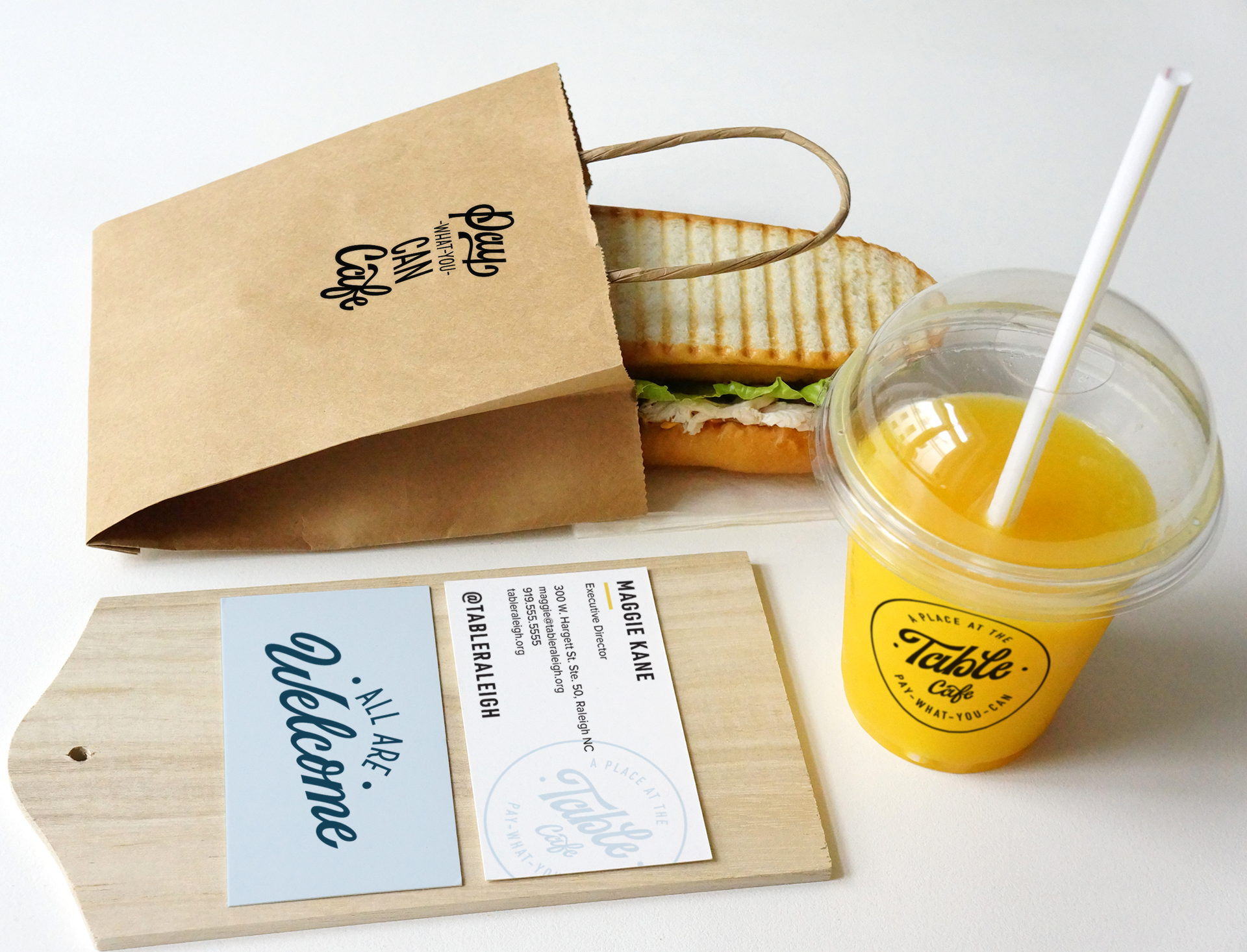
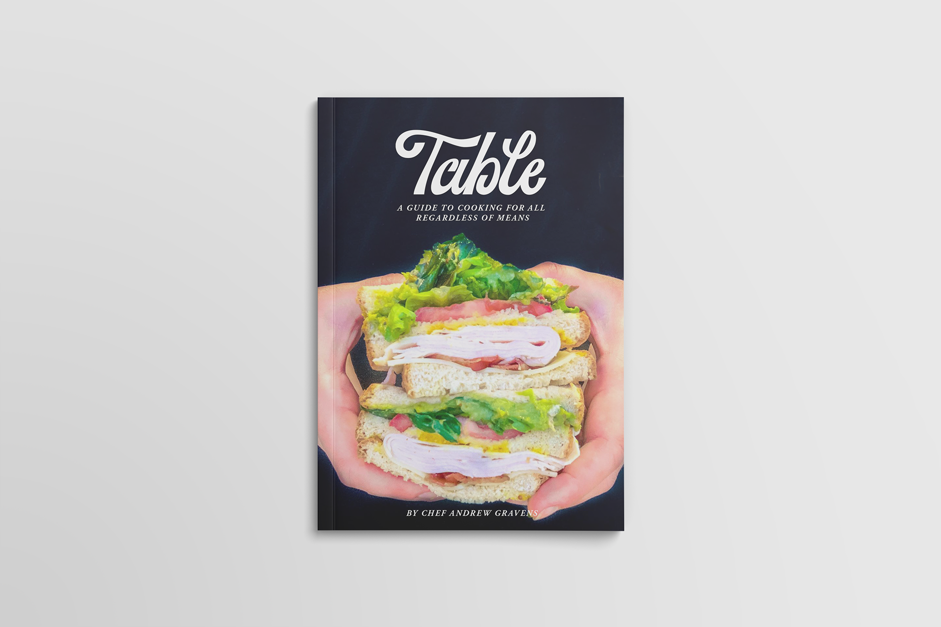
l led a rebranding effort to align the cafe’s visual identity, brand assets, and interior design to promote its mission, core values, and the brand’s story. I created a new typographic-centric identity that evokes classic American diner motifs. Claire Allison hand-lettered the custom logo and tagline.
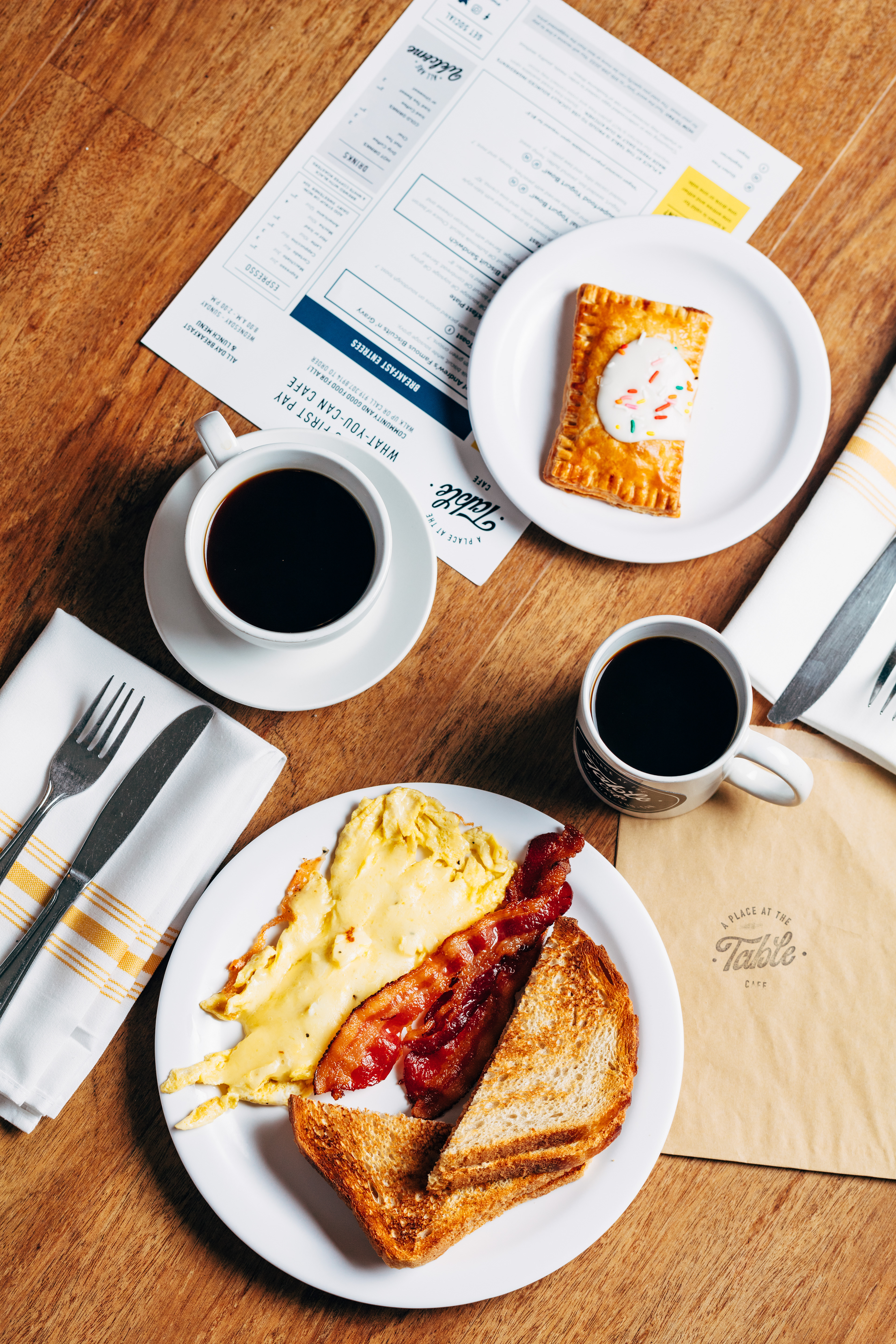
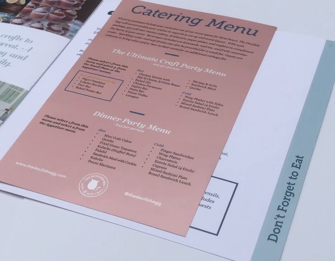
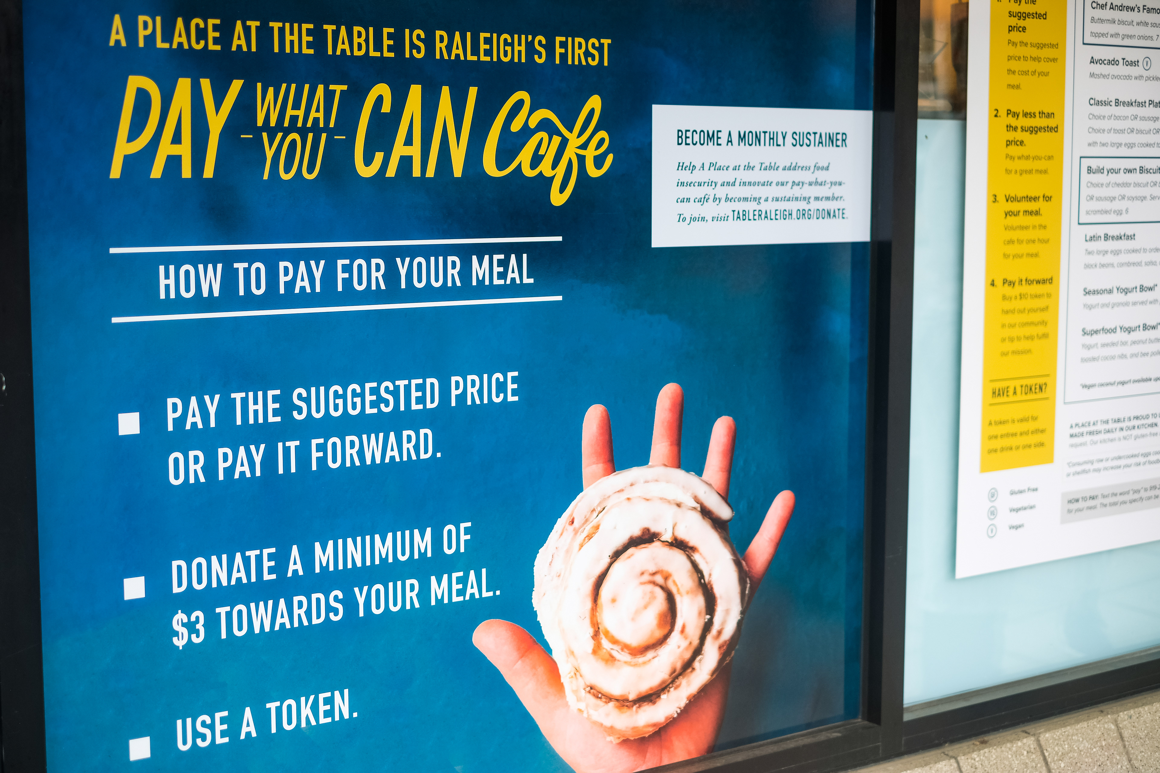
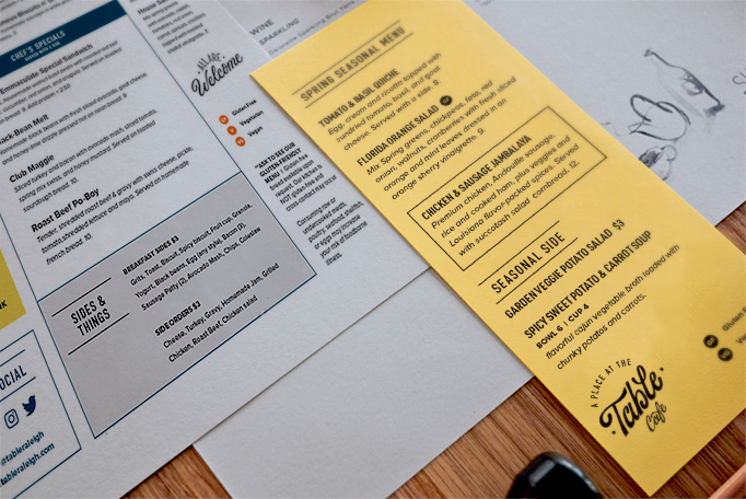
The menu redesign promotes the cafe’s scratch-made food while explaining the unique ways to pay. I added a call to action to promote ordering ahead of time for curbside pickup during COVID-19 dining restrictions. Since the cafe is pay-what-you-can, the new menu deemphasizes prices, so it’s not a deciding factor when ordering.


I created new signage and environmental graphics to mark a sense of place and provide a warm and inviting atmosphere.


Role: Art Director & Designer
Agency: Sababa Design
Lettering Artist: Claire Allison
Photography: Trimark Digital;
Genna Martella
Sign installation: Capital Sign Solutions
Agency: Sababa Design
Lettering Artist: Claire Allison
Photography: Trimark Digital;
Genna Martella
Sign installation: Capital Sign Solutions