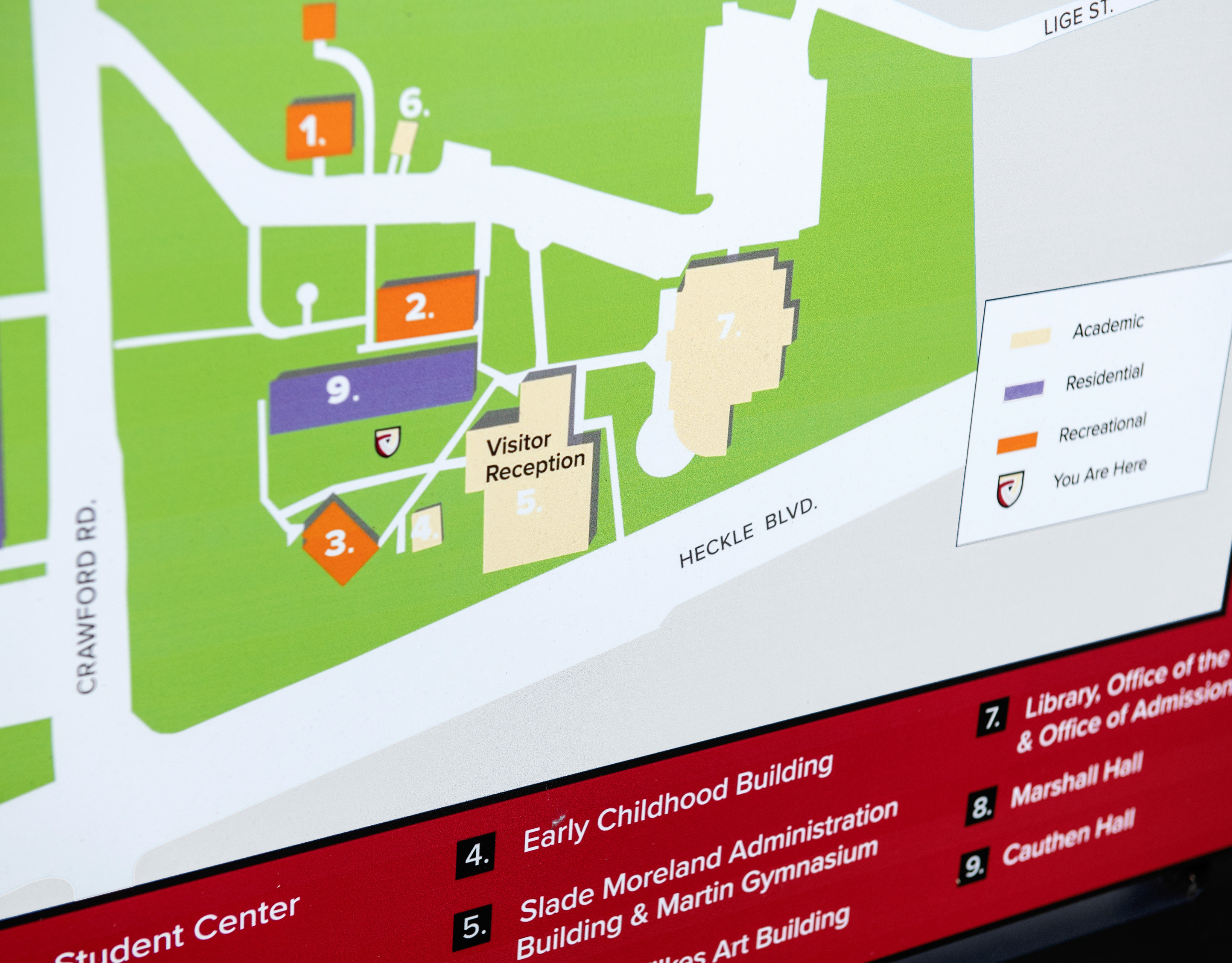
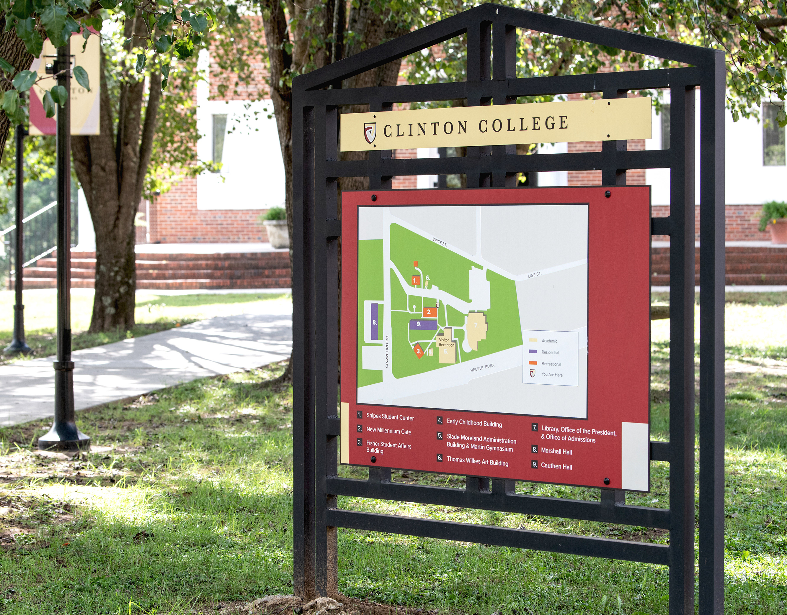
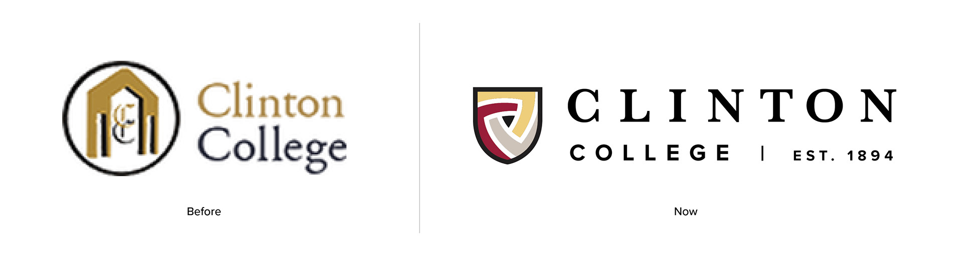
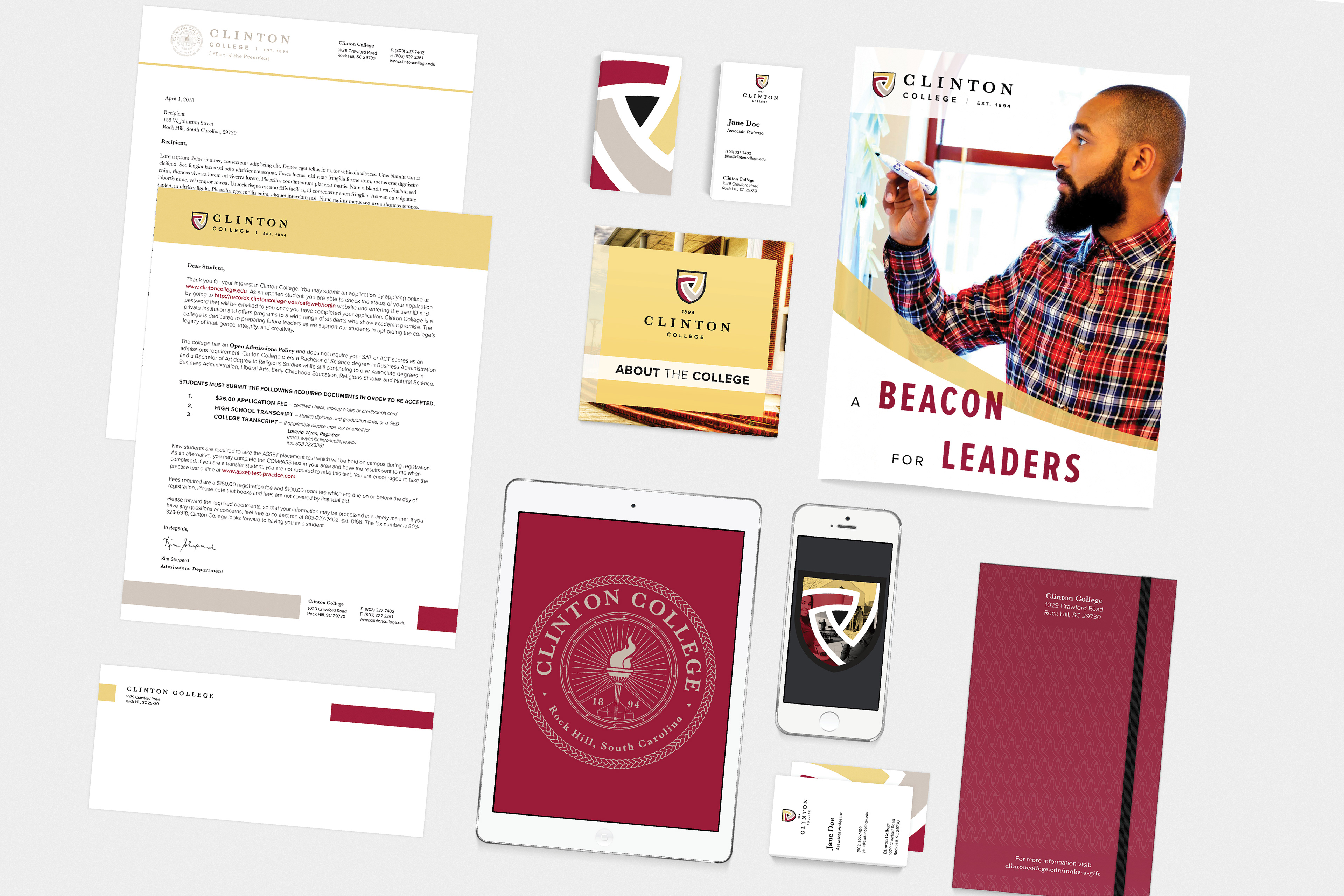
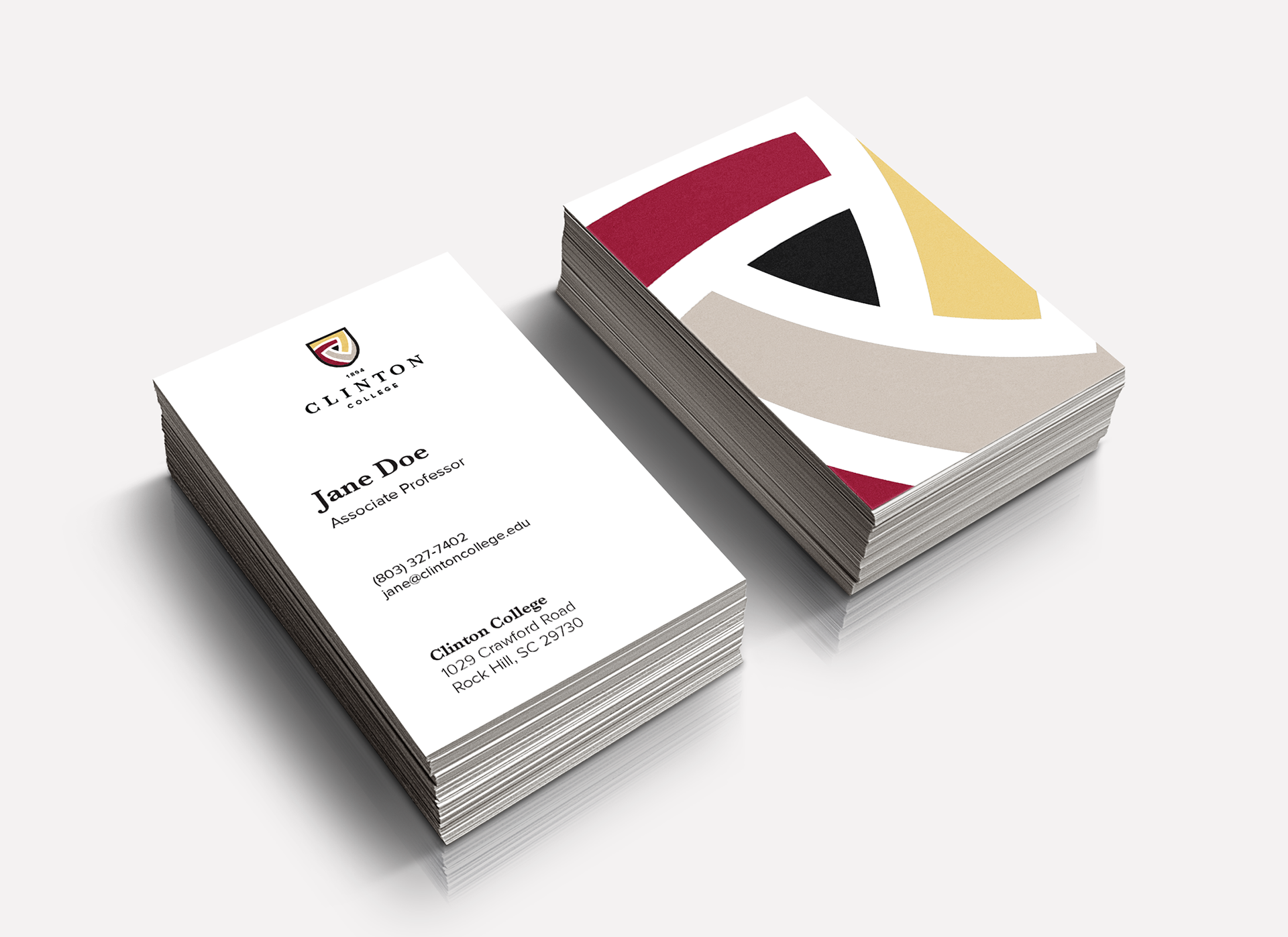
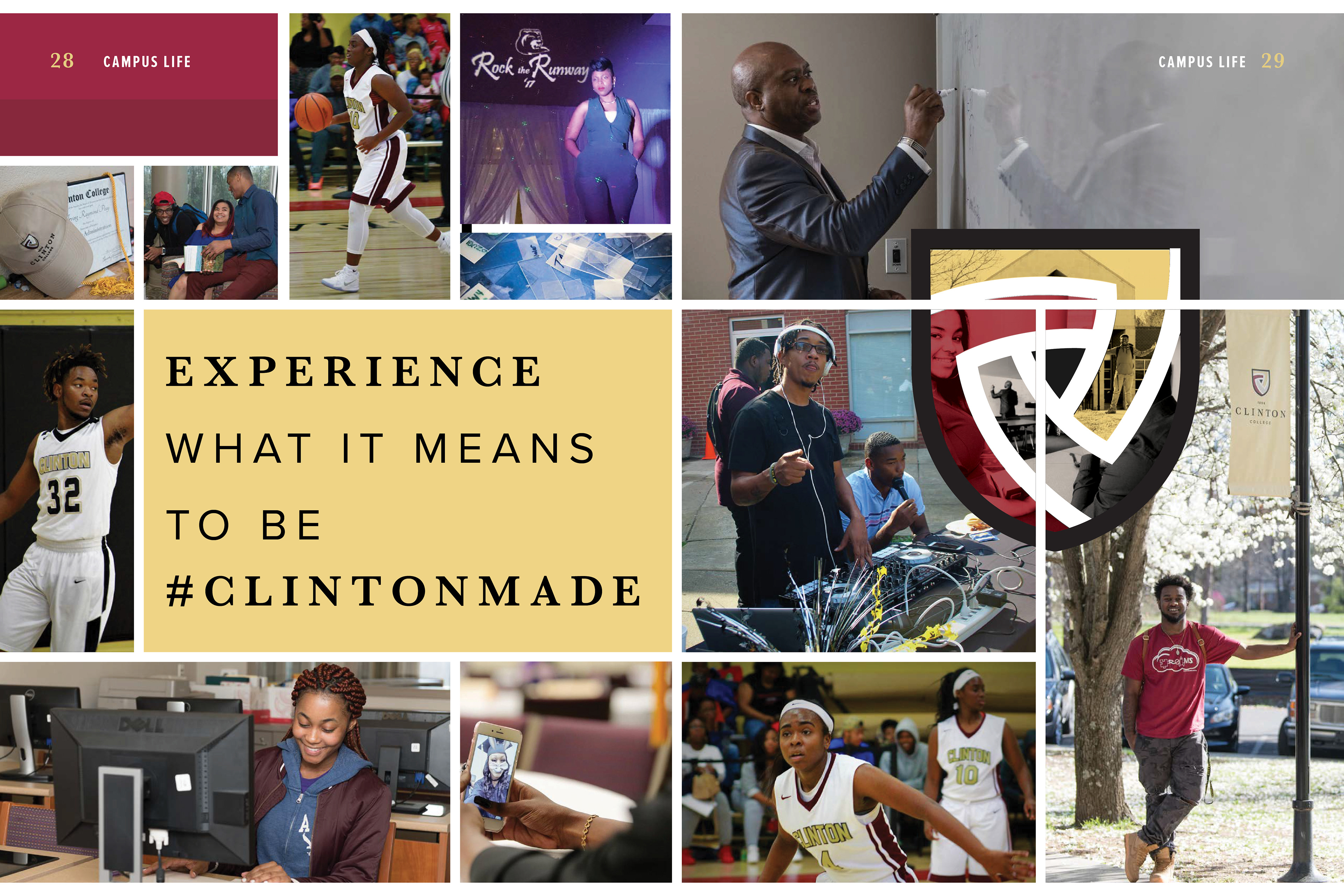
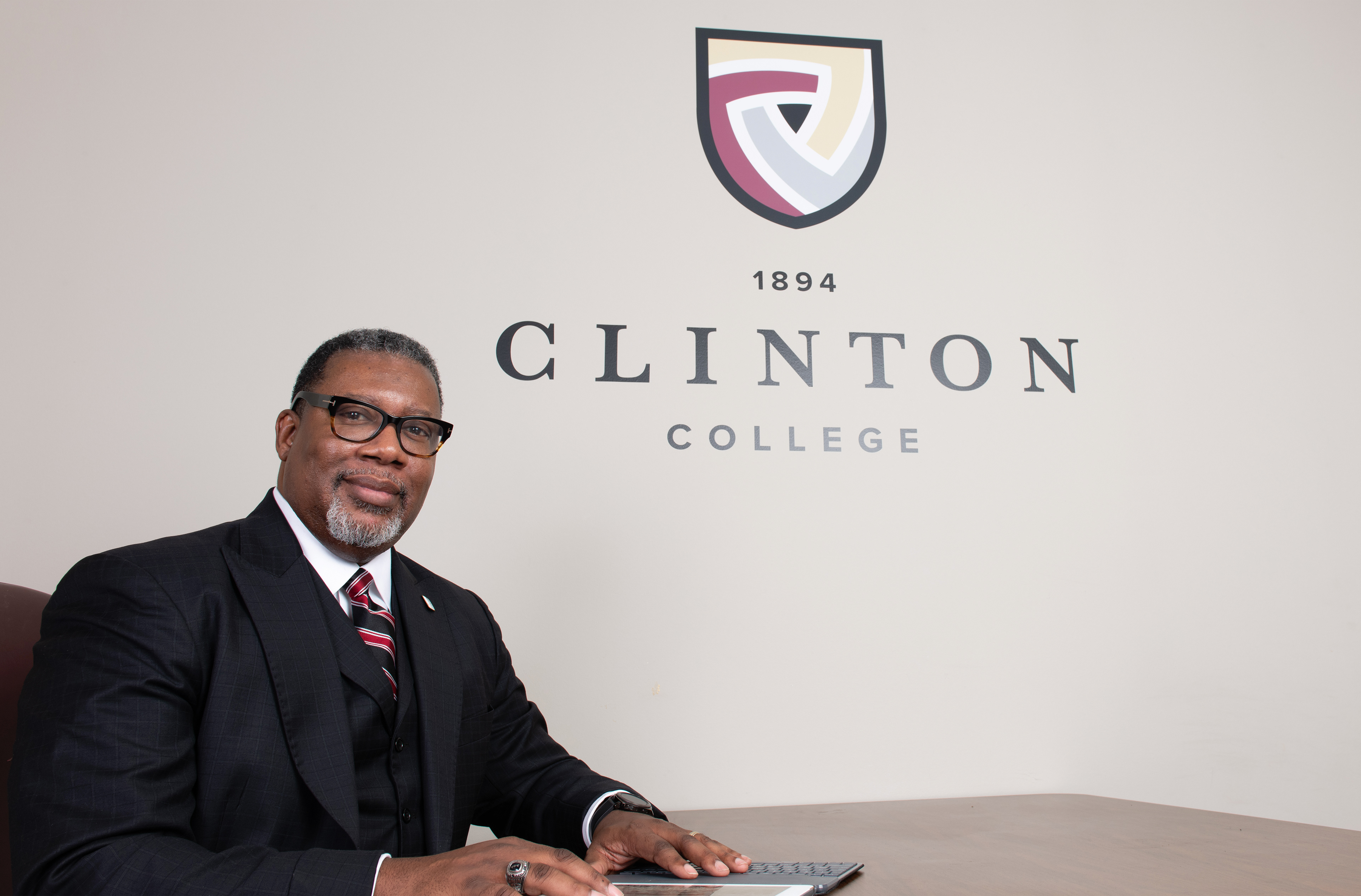
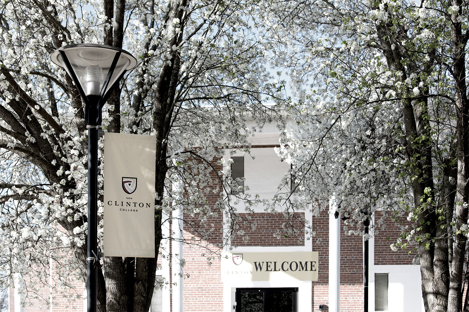
Clinton College is the oldest academic institution in Rock Hill, SC. in 2017, under new leadership, Clinton began to offer 4-year bachelor degrees. I was brought on to lead a rebranding process to position the college as an excellent choice for affordable education for students looking for professional training and better themselves.
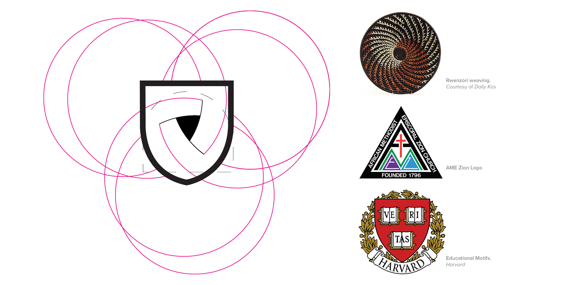
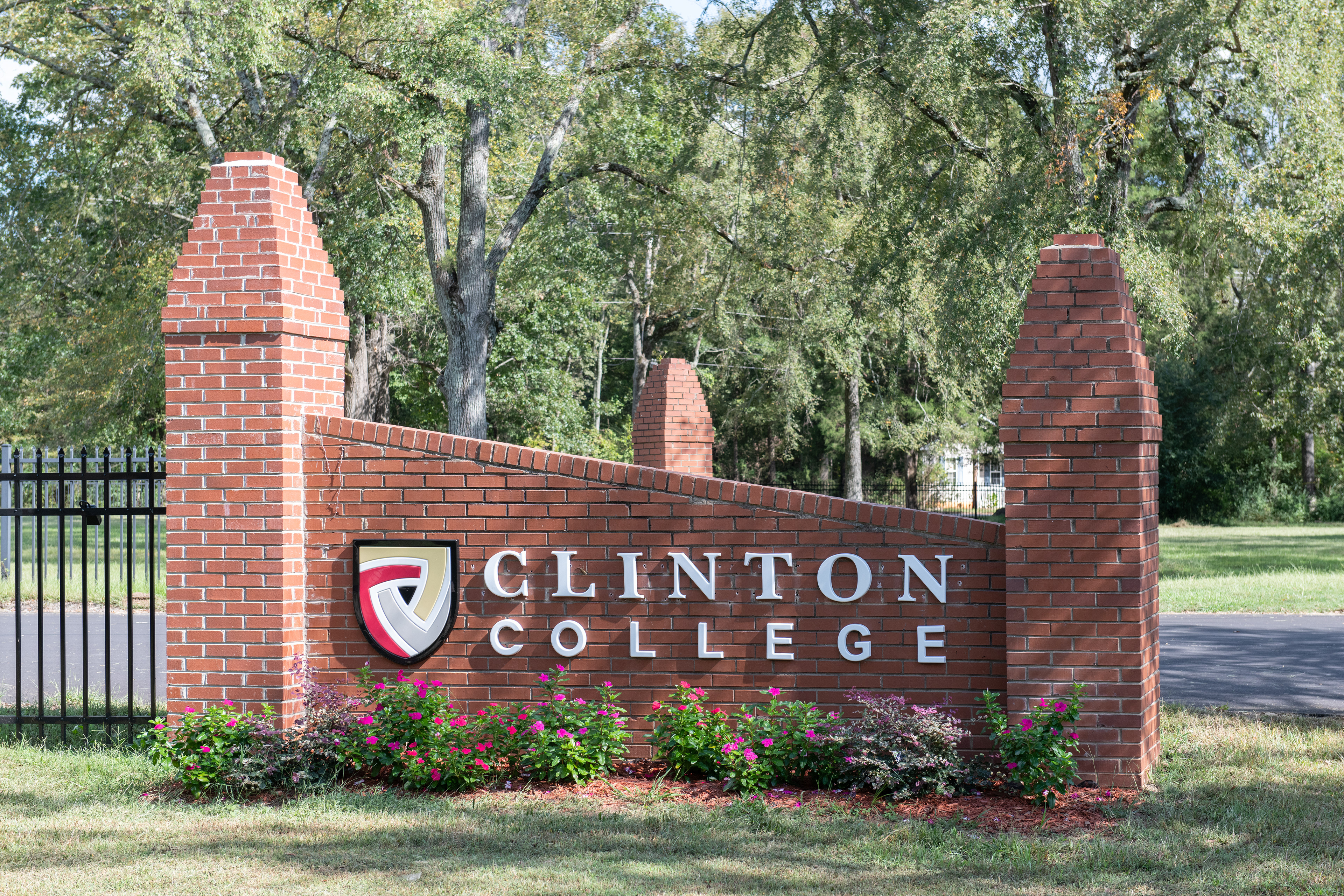
Clinton is a Historically Black College and University (HBCU ) institution that was founded by the African Methodist Episcopal Zion Church. During research, I found many parallels between historic downtown Rock Hill and campus. The Carolina region is renowned for its woven textile manufacturing. The college is very close to old textile plants and it's where many of the earliest alumni began work after graduating.
I wanted to celebrate a larger woven tradition from Carolina to its roots in Africa. Traditional Ugandan Rwenzori basket-weaving used radial design and an earthy color palette. The new brand identity is heavily influence by their history and tradition.
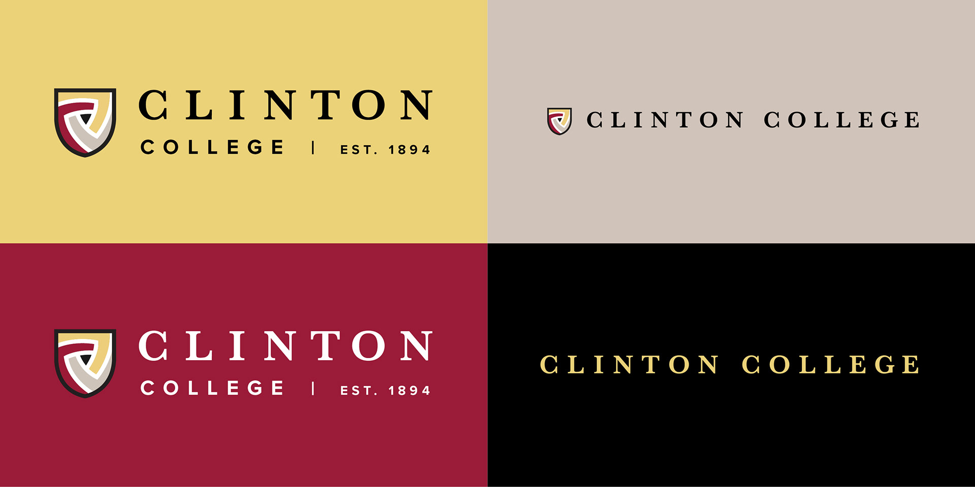
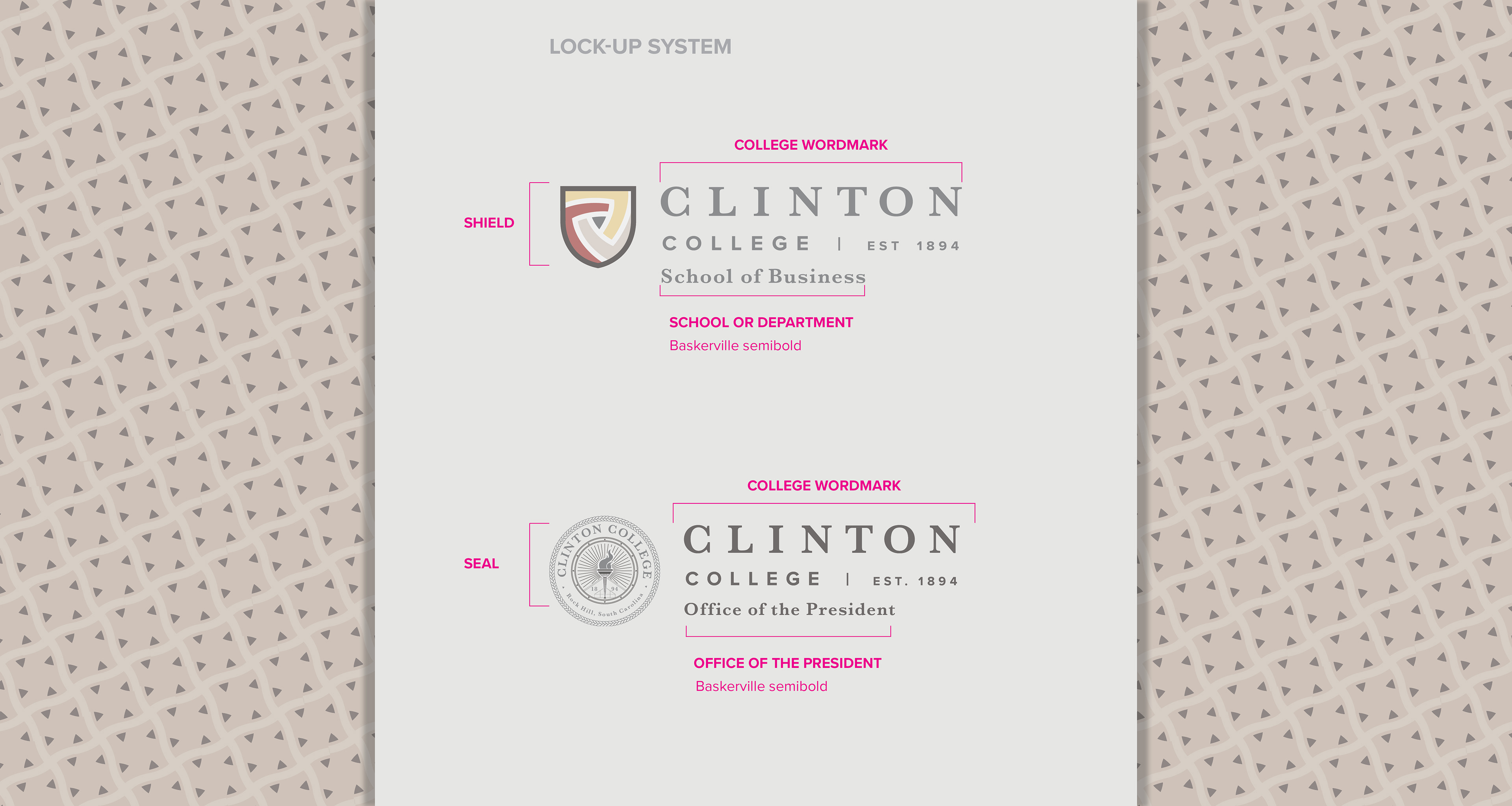

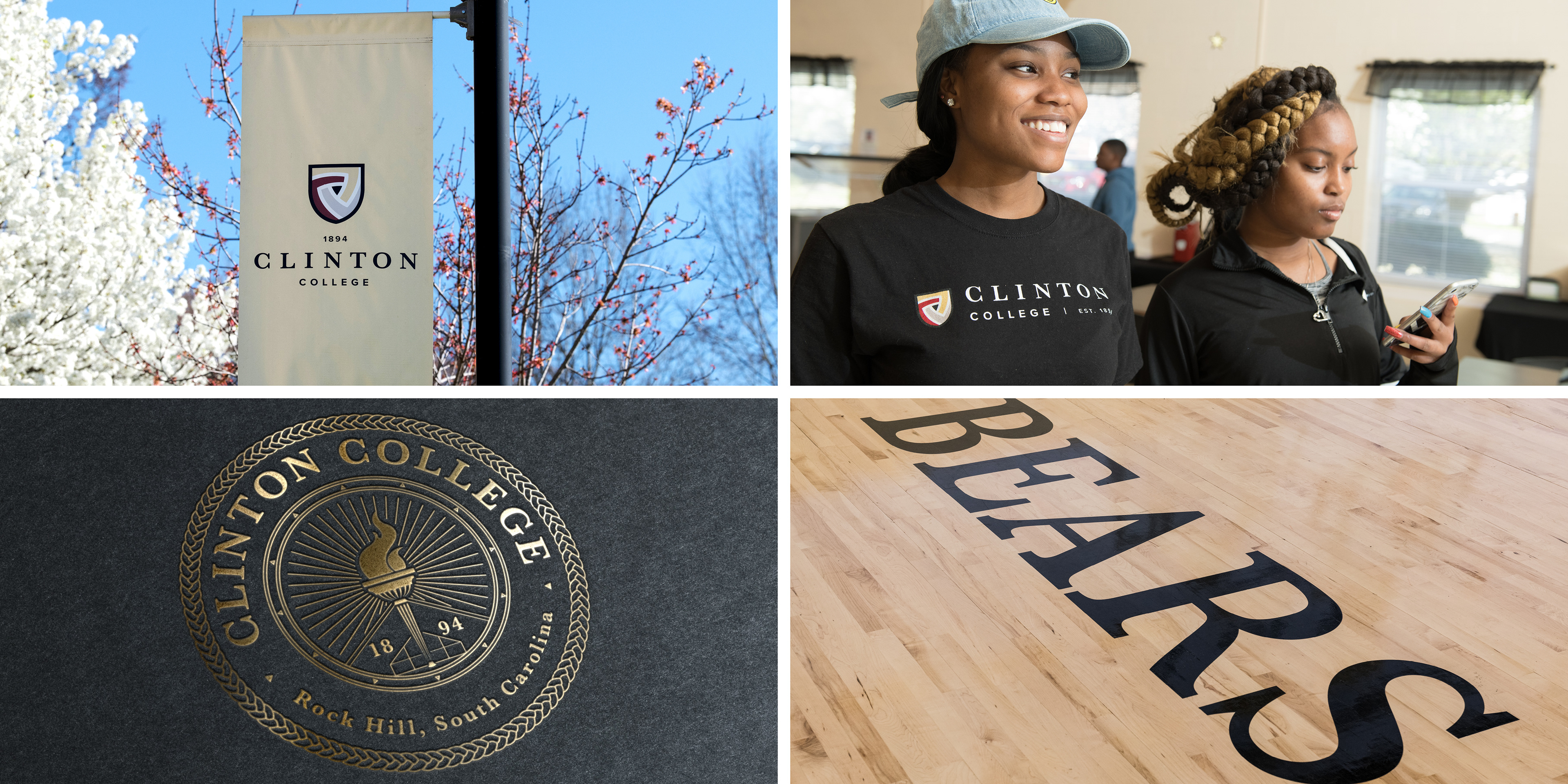
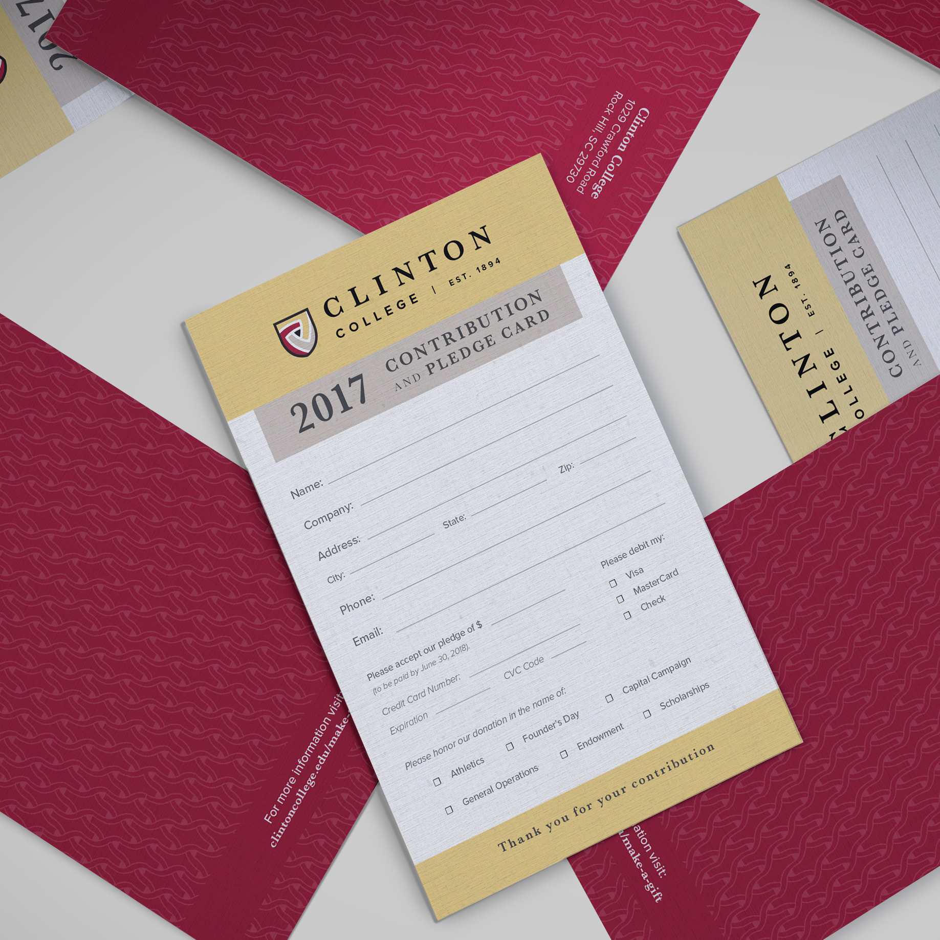
The final mark is a radial design where three C’s are stitched together culminating in a triangle. The mark celebrates a larger woven tradition from Carolina to Africa. Even the colors, gold, maroon, and brown are tributes to the same color used in traditional Ugandan Rwenzori dye.
The triangle at the center represents Clinton’s roots as an African Methodist Episcopal Zion institution. The gold, maroon and beige colors represent intellect, action, and heritage respectively. The colors blend at the center to create a black triangle, which symbolize how Clinton blends academics, tradition, and community to form a unique campus.


Role: Art Director & Designer
Agency: Sababa Design
Photography: Michael Baker
Sign Installation: Jim Brown Signs
Agency: Sababa Design
Photography: Michael Baker
Sign Installation: Jim Brown Signs